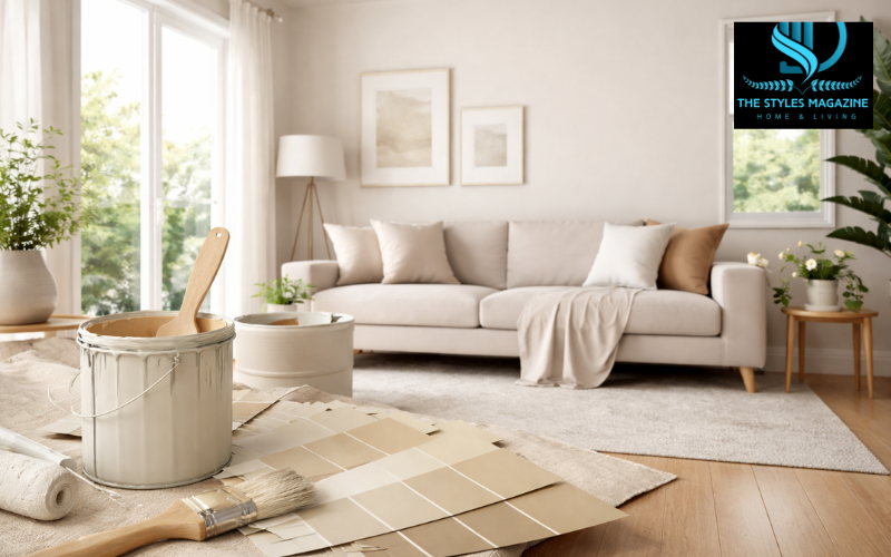
Off white paint is one of the most versatile and widely used color choices in modern interiors. Unlike pure white, which can sometimes feel too bright or clinical, off-white includes subtle hints of other colors such as cream, beige, or gray. These slight variations make it softer on the eyes and more welcoming in everyday spaces.
What makes o ff-white paint especially popular is its ability to adapt. It works well in both traditional and modern homes, blending easily with different furniture styles and décor themes. Whether you want a cozy bedroom, a calm living room, or a clean kitchen, off-white can help create the right atmosphere without overpowering the space.
Undertones play a key role in how off-white paint looks once applied. A warm off-white can make a room feel inviting and comfortable, while a cool off-white can create a fresh and airy feel. These small differences can completely change the mood of a room.
In this guide, you’ll learn what off-white paint really is, how to choose the right shade for your home, how lighting affects your choice, and which popular options are trusted by designers. You’ll also find helpful tips for selecting the perfect off-white paint for your space, including options available in Pakistan.
Warm vs Cool Off-White Paint
| Feature | Warm Off-White Paint | Cool Off-White Paint |
| Undertones | Yellow, cream, beige | Gray, blue, green |
| Feel of the Room | Cozy, inviting, soft | Clean, fresh, modern |
| Best for Rooms | North-facing, low-light spaces | South-facing, bright rooms |
| Style Match | Traditional, rustic interiors | Modern, minimalist interiors |
| Lighting Effect | Adds warmth | Balances excess warmth |
What Is Off-White Paint and Why It’s So Popular
Off white paint refers to shades that are very close to white but include a slight tint of another color. These tints can be warm, like yellow or beige, or cool, like gray or blue. Because of these subtle additions, off-white paint feels softer and more natural compared to pure white.
The main difference between pure white and off-white paint lies in how they appear in real spaces. Pure white can sometimes look too bright, especially under strong lighting, making a room feel harsh or sterile. Off-white, on the other hand, adds just enough warmth or softness to make the environment more comfortable.
Homeowners and interior designers often prefer off-white paint because it is easy to work with. It acts as a neutral base, allowing other elements like furniture, artwork, and textiles to stand out. At the same time, it adds more depth than plain white, preventing the space from looking flat or boring.
Another reason for its popularity is flexibility. Off-white paint works well in small rooms as well as large open areas. It reflects light beautifully, making spaces appear brighter without being overwhelming. This balance is what makes off-white paint a timeless choice.
Understanding Off-White Undertones (Warm vs Cool)
Undertones are the hidden colors within a paint shade that influence how it looks on your walls. In off-white paint, these undertones are very subtle, but they have a big impact on the final result.
Warm off-white shades include hints of yellow, cream, beige, or even soft peach. These colors create a cozy and inviting feeling, making them ideal for spaces where comfort is important. They are often used in living rooms, bedrooms, and areas with limited natural light.
Cool off-white shades, on the other hand, contain touches of gray, blue, or green. These undertones give a cleaner and more modern appearance. They work well in spaces that receive a lot of sunlight, helping to balance the warmth of natural light.
The mood of a room can change significantly depending on the undertone you choose. A warm off-white can make a space feel relaxed and welcoming, while a cool off-white can make it feel calm and refreshing.
Identifying undertones can be simple if you know what to look for. One way is to compare the paint sample with pure white. The difference will reveal whether the shade leans warm or cool. Another method is to observe the paint in different lighting conditions, as undertones become more noticeable throughout the day.
How Lighting Affects Off-White Paint Choices
Lighting is one of the most important factors when choosing off-white paint. The same shade can look completely different depending on how much light a room receives and the type of light present.
Natural light changes throughout the day, affecting how paint colors appear. In the morning, light tends to be cooler, while in the evening it becomes warmer. This means your off-white paint might look slightly different at different times.
Room direction also plays a major role. North-facing rooms usually receive cooler, indirect light. In such spaces, warm off-white paint can help balance the cool tones and make the room feel more comfortable. South-facing rooms, on the other hand, get strong, warm sunlight, so a cool off-white can help prevent the space from feeling too yellow or bright.
Artificial lighting also influences color perception. Warm bulbs can enhance yellow or beige undertones, while cool LED lights can highlight gray or blue tones. Because of this, it’s important to consider both natural and artificial lighting when choosing your off-white paint.
Testing a paint shade under your room’s actual lighting conditions is the best way to ensure you get the desired result.
Most Popular Off-White Paint Colors Used by Designers
Interior designers often rely on certain off-white paint shades because they perform consistently well in different settings. These shades have been tested in various lighting conditions and are known for their balanced undertones.
Some widely recognized options include Benjamin Moore’s White Dove, which is appreciated for its soft and warm appearance that doesn’t feel too yellow. Another popular choice is Swiss Coffee, known for its creamy tone that suits traditional interiors.
Sherwin-Williams Alabaster is also a favorite among professionals. It offers a clean yet cozy look, making it suitable for both modern and classic homes. Farrow & Ball’s Ammonite, on the other hand, leans toward a cooler gray-white tone, which works well in minimalist and contemporary spaces.
These shades are considered reliable because they strike a good balance between warmth and neutrality. They are versatile enough to work across different rooms and styles, which is why designers often recommend them for both new projects and renovations.
Choosing the Right Off-White for Each Room
Selecting the right off-white paint depends on how each room is used and the atmosphere you want to create. Different spaces have different needs, and the right shade can enhance both comfort and functionality.
In living rooms, off-white paint should create a welcoming and relaxed environment. Warm undertones often work well here, especially if the room is used for gatherings or family time. They help make the space feel more inviting.
Bedrooms benefit from softer, calming shades. Depending on your preference, you can choose a warm off-white for a cozy feel or a slightly cooler tone for a more peaceful and airy environment.
Kitchens and bathrooms often require a cleaner look. Cool off-white paint can give these spaces a fresh and hygienic appearance, especially when paired with modern fixtures and finishes.
It’s also important to consider how the paint interacts with your furniture and décor. Off-white paint should complement existing elements rather than clash with them. A well-matched shade can tie the entire room together.
Off-White Paint Combinations and Color Pairing Ideas
One of the biggest advantages of off-white paint is how easily it pairs with other colors. It serves as a neutral base that allows you to experiment with different design styles.
When paired with other neutrals like gray, beige, or taupe, off-white creates a soft and harmonious look. This combination is ideal for those who prefer a subtle and elegant interior.
For a more striking effect, off-white can be combined with darker tones such as charcoal, navy, or deep brown. This contrast adds depth and visual interest without overwhelming the space.
You can also use off-white paint as a background for colorful accents. Whether it’s cushions, artwork, or rugs, the neutral base allows these elements to stand out while maintaining a balanced overall design.
Top Off-White Paint Options Available in Pakistan
In Pakistan, several well-known paint brands offer quality off-white paint options that suit different budgets and preferences. These brands provide a wide range of shades designed for local conditions and interior styles.
Dulux Pakistan is one of the leading names, offering shades like Pentalite Classic Off-White 6502. These paints are known for their smooth finish and durability. Prices typically vary depending on the product type and packaging size.
Berger Paints Pakistan also provides a variety of off-white options, including NU Emulsion Off-White 2141. These paints are often more budget-friendly while still delivering good performance.
Master Paints is another popular choice, offering standard off-white shades suitable for everyday use. Their products are widely available and cater to both residential and commercial needs.
Overall, the availability of off-white paint in Pakistan makes it easy for homeowners to find a suitable option that fits their style and budget.
Common Mistakes to Avoid When Choosing Off-White Paint
Choosing off-white paint may seem simple, but there are common mistakes that can affect the final result. One of the biggest errors is ignoring undertones. Even a slight difference in undertone can change how a room feels.
Another common mistake is skipping the testing process. Relying on a small color chip or online image can lead to unexpected results once the paint is applied on a larger surface.
Lighting is often overlooked as well. Many people choose a shade without considering how it will look under different lighting conditions, which can lead to disappointment.
Finally, selecting paint based only on photos or trends can be misleading. What looks good in one space may not work in another due to differences in lighting, layout, and décor.
Tips for Testing and Finalizing the Perfect Shade
Testing is a crucial step when choosing off-white paint. Before making a final decision, it’s important to try samples directly on your walls. This gives you a realistic idea of how the color will look in your space.
Observing the paint at different times of the day can help you understand how lighting affects its appearance. A shade that looks perfect in the morning might appear different in the evening.
Using larger sample patches instead of small swatches is also helpful. This allows you to see how the color interacts with the room as a whole, including furniture and flooring.
Taking the time to test and compare options can save you from costly mistakes and ensure you choose the perfect off-white paint for your home.
Conclusion
Off-white paint is a smart and flexible choice for almost any space. Its subtle variations make it more adaptable than pure white, allowing you to create a comfortable and visually appealing environment.
By understanding undertones, considering lighting, and selecting shades that match your room’s purpose, you can achieve a balanced and harmonious look. Whether you prefer warm or cool tones, off-white paint offers endless possibilities for design.
Taking the time to test different shades and observe how they interact with your space will help you make a confident decision. In the end, the right off-white paint can transform your home into a calm, inviting, and beautifully coordinated space.
FAQs
What Is The Difference Between White And Off White Paint?
White paint is pure and bright, while off white paint has subtle undertones that make it softer and more comfortable for everyday spaces.
Which Off White Paint Is Best For Small Rooms?
Light warm or neutral off-white shades work best as they reflect light and make small rooms feel bigger and more open.
Does Off White Paint Look Yellow On Walls?
Some warm off-whites may appear slightly yellow, especially under warm lighting, but balanced shades avoid this effect.
Can Off White Paint Be Used In Modern Interiors?
Yes, cool off-white shades with gray undertones are perfect for modern and minimalist designs.
How Do I Test Off White Paint Before Buying?
Apply a sample on your wall and check it in natural and artificial light throughout the day to see how it changes.
Enjoyed it? Find more exclusive content on The Styles Magazine.
Disclaimer: This article is for informational purposes only. Paint colors may appear differently depending on lighting, surface, and environment. Always test samples before making a final decision. Prices and availability may vary by location and brand.