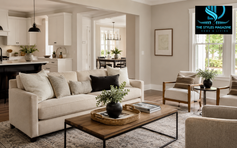
Agreeable Gray paint is one of those neutral colors that can feel comfortable in many different homes. Sherwin-Williams Agreeable Gray SW 7029 blends the softness of beige with the steady, balanced look of gray. That mix is why it is usually described as a greige. It is warm enough to avoid looking cold, yet gray enough to keep it from feeling like a traditional tan.
Sherwin-Williams currently calls Agreeable Gray its best-selling paint color and describes it as a gray with a beige undertone and subtle warmth. The company also shows it in a wide range of real rooms, including kitchens, bedrooms, bathrooms, and exterior applications. Still, its popularity does not mean it will look perfect in every home. Paint color changes with daylight, bulbs, flooring, countertops, furniture, and nearby wall colors.
This guide covers the color’s LRV, undertones, lighting behavior, room uses, pairings, alternatives, and buying options. Most importantly, test a physical sample in the intended room because a screen image cannot show exactly how it will react there.
Agreeable Gray Quick Guide
| Feature | Details |
| Brand | Sherwin-Williams |
| Color Code | SW 7029 |
| Color Family | Warm greige |
| LRV | About 60 |
| Main Undertone | Warm beige |
| Possible Secondary Cast | Soft green or gray |
| Best Uses | Living rooms, bedrooms, hallways, kitchens, and cabinets |
| Popular Trim Colors | Pure White SW 7005, Extra White SW 7006, Alabaster SW 7008 |
| Similar Color | Repose Gray SW 7015 |
| Best Advice | Test a large sample in the room before buying |
What Color Is Sherwin-Williams Agreeable Gray SW 7029?
Agreeable Gray sits between a soft warm gray and a light beige. It does not look as cool or silvery as many true grays, and it is not as yellow or golden as many classic beige colors. In balanced light, it normally reads as a relaxed warm neutral that can support both traditional and modern decorating styles.
The official Sherwin-Williams color data places Agreeable Gray in the neutral family. Its color number is SW 7029, and the brand describes its main undertone as beige. That beige influence gives the paint its welcoming quality, while the gray component keeps it quieter and less creamy than a typical warm beige.
The paint can look different from house to house because it is never seen alone. Warm oak may make it look grayer, while cool daylight may reveal more of its muted gray-green side. Tile, trim, upholstery, and bulbs also affect how the eye reads it.
Agreeable Gray LRV and Overall Depth
LRV stands for Light Reflectance Value. In simple terms, it tells you how much light a paint color reflects. A higher number reflects more light and usually looks lighter, while a lower number absorbs more light and appears deeper. Sherwin-Williams explains that LRV affects how a color looks as the amount of light in a room changes during the day.
Agreeable Gray has an official LRV of about 60.4, which is usually rounded to 60. This places it in the light range, but it is not close to white. It reflects enough light to keep many rooms open and comfortable while still giving the walls visible color and definition.
Agreeable Gray is lighter than many medium grays but deeper than most off-whites. It can look airy in sun and noticeably darker in a shaded room. Window size, room direction, shadows, and bulb temperature still matter, so LRV cannot predict the exact result by itself.
Agreeable Gray Paint Undertones
The main undertone in Agreeable Gray paint is warm beige. That is the quality most people notice first, especially in rooms with warm natural light, wood furniture, cream fabrics, or soft-white bulbs. Its warmth prevents it from feeling flat or industrial.
However, Agreeable Gray can also show a quiet green-gray cast. This is not usually a bold green tone. It is more like a grounded, earthy shift that may appear when the paint is placed beside colors with pink, violet, or orange undertones. In some spaces, it may also lean slightly taupe, especially under warm evening light.
Nearby finishes often control which undertone becomes noticeable. Pink-beige tile can make Agreeable Gray look greener, while orange wood may make it seem grayer. Cool LEDs can reduce its beige side, and warm bulbs can make it softer and more tan. The room’s existing materials must therefore be considered before painting.
How Agreeable Gray Changes in Different Lighting
In north-facing rooms, daylight is usually cooler and less direct. Agreeable Gray may look grayer, quieter, or slightly green in this setting. Its LRV can help it remain usable, but a north-facing room with small windows may still make the color feel heavier than expected. Sherwin-Williams recommends considering LRV and sampling warmer or cooler shades when choosing paint by room direction.
South-facing rooms receive warmer, stronger light for much of the day. Here, Agreeable Gray often looks lighter, warmer, and more beige. This can create a soft, welcoming effect, though very warm flooring or yellow bulbs may push it further toward beige.
East-facing rooms are warmer in the morning and cooler later; west-facing rooms often do the opposite. Agreeable Gray may therefore shift noticeably during the day.
In a windowless room or dim hallway, the color may look deeper and more muted. Warm LEDs can emphasize beige, while cool LEDs can reveal more gray or green. Check a large sample in the morning, afternoon, and evening, with both the natural and artificial lights you normally use.
Best Rooms for Agreeable Gray Paint
Agreeable Gray works well in living rooms because it provides a calm background for wood furniture, cream seating, black accents, and changing seasonal décor. In bedrooms, it can feel restful without becoming plain. It is also useful in hallways and open-plan spaces where one wall color must connect several rooms.
Dining rooms can benefit from its warmth, especially with wood tables and soft lighting. In a whole-home scheme, it can create continuity while each room keeps its own accents. Sherwin-Williams presents the shade across several room types.
It is less successful in spaces where every fixed finish has a conflicting undertone. A room filled with pink-beige tile, strong violet-gray stone, or highly orange wood may make the paint look muddy or slightly green. It can also feel too dark in a room with little light if the goal is a bright off-white look. For whole-home use, sample it in every major lighting condition rather than approving it based on one room.
Agreeable Gray Kitchen Cabinets and Walls
On kitchen walls, Agreeable Gray can soften bright white cabinets and connect stainless steel appliances with warm flooring. It also works with many quartz, granite, and marble-look surfaces, but only when their undertones agree. A countertop with soft gray, beige, or warm veining is often easier to coordinate than one with strong pink, blue, or violet tones.
Agreeable Gray kitchen cabinets offer a gentler alternative to stark white. The color has enough depth to outline doors and drawers while keeping the kitchen light. It can pair with white or cream walls, dark hardware, warm wood islands, and selected black or charcoal accents. Sherwin-Williams has also featured Agreeable Gray on kitchen cabinetry and in kitchen settings.
Place a sample beside the countertop, backsplash, flooring, and hardware; these fixed surfaces matter more than an online photo.
For sheen, an eggshell or washable low-sheen finish is common on walls. Cabinets need a harder, smoother coating made for trim or cabinetry. Sherwin-Williams recommends durable cabinet products in satin, semi-gloss, or gloss finishes, while semi-gloss is also a practical choice for trim and molding because it is easier to clean.
Flooring, Furniture, and Décor That Work with Agreeable Gray
Agreeable Gray often looks natural with warm oak, medium-brown wood, and dark walnut because its beige side connects with the warmth of the wood. Some cooler floors can also work, especially when they are softly blended rather than strongly blue-gray. The key is to compare samples instead of assuming that every gray floor will match a gray-based wall color.
Cream upholstery, woven rugs, linen, wool, leather, and other natural textures help create a warm and layered room. Black metal, charcoal pillows, or dark picture frames add definition. Muted blue, dusty blush, and soft green accents can bring color without fighting the neutral background.
Strong pink, orange, yellow, or violet finishes can create conflicts. To warm the room, add wood, cream, tan, and warm lighting. For a brighter effect, use light curtains and clean white trim; for a modern look, add black accents and controlled contrast.
Best Trim and Coordinating Colors
Pure White SW 7005 is a popular trim choice when you want a clean contrast that is not extremely cold. Extra White SW 7006 creates a crisper, brighter edge, which can suit modern rooms and cooler materials. Alabaster SW 7008 gives a softer transition because it is warmer and creamier. Sherwin-Williams currently shows Pure White, Extra White, and Alabaster alongside Agreeable Gray within its popular and coordinating color selections.
Accent colors can include muted blue, deep charcoal, soft blush, cream, black, and warm natural wood. Sherwin-Williams officially lists Extra White, Incredible White, and Coral Rose among Agreeable Gray’s coordinating colors, showing how the neutral can support both light trim and warmer accents.
Sample the trim and wall colors together because a white may appear blue, yellow, or dull beside Agreeable Gray. Using one white on ceilings, doors, and molding creates consistency, with a flatter finish usually chosen for the ceiling.
Understanding the Agreeable Gray Color Strip
A paint strip helps show the family relationship between nearby colors. Agreeable Gray’s official Sherwin-Williams strip reference is 243-C1. On the same documented sequence, Anew Gray SW 7030 appears as the next deeper color, followed by Mega Greige SW 7031. This can help you understand how Agreeable Gray relates to warmer, stronger greige shades.
The color strip is useful for finding a darker accent, cabinet color, or deeper neutral. However, same-strip colors are not automatic matches for every surface. Use the strip to narrow options, then test the candidates beside your flooring, stone, wood, and lighting.
Agreeable Gray vs Repose Gray
Agreeable Gray SW 7029 and Repose Gray SW 7015 are both popular light neutrals, but they do not create the same mood. Agreeable Gray is usually warmer and more beige. Repose Gray tends to read as a clearer light gray, although it also carries warmth and may reveal subtle undertones depending on the room.
Their official LRV values are close: Agreeable Gray is about 60.4, while Repose Gray is about 58.2. This means Agreeable Gray reflects slightly more light, but the difference is small enough that undertones and room lighting may matter more than the numbers. Sherwin-Williams describes Repose Gray as a light gray with tranquil tones and soothing warmth.
Agreeable Gray often suits warm woods, cream fabrics, and beige-based stone. Repose Gray may fit better with cooler flooring, crisp whites, and modern gray finishes, though sampling is still essential. In low light, both colors deepen, but Agreeable Gray may become more beige or earthy while Repose Gray may look more clearly gray.
Agreeable Gray Paint and Benjamin Moore Alternatives
Agreeable Gray SW 7029 is a Sherwin-Williams color. There is no official Benjamin Moore version with the same formula, so searches for “Agreeable Gray paint Benjamin Moore” usually refer to similar greige alternatives or a custom color match.
Benjamin Moore Edgecomb Gray HC-173 is one possible alternative. The brand describes it as a warm, welcoming neutral and gives it an LRV of 63.09, making it slightly lighter than Agreeable Gray. Edgecomb Gray often appears more beige and delicate, though the result depends on lighting and nearby finishes.
Revere Pewter HC-172 is deeper, with an official LRV of 55.05. Benjamin Moore describes it as a versatile bridge between warm and cool tones. Compared with Agreeable Gray, it can feel richer, moodier, and more noticeable on the wall.
A computerized match may come close, but different paint brands use different bases, pigments, products, and sheen systems. For the most predictable result, buy the original color from its brand or test the matched formula on a large board before committing.
Sampling and Where to Buy Agreeable Gray Paint
Agreeable Gray paint is available through Sherwin-Williams stores and the brand’s official website. Current sampling options shown by Sherwin-Williams include a free color chip, a peel-and-stick sample, and a liquid paint sample. The color can also be ordered in interior or exterior paint products, depending on the project.
A small chip helps with early comparison, but a larger sample is more reliable. Apply two coats to a movable sample board and place it on different walls beside flooring, cabinets, and furniture. A wall test shows the real texture, although the existing color can influence it unless properly covered.
Before ordering a full gallon, check the sample in daylight and artificial light, confirm it against fixed finishes, decide on the correct sheen, and verify the exact product for the surface. Sherwin-Williams also warns that screen colors may differ from the real paint and recommends viewing a physical sample before purchase.
Conclusion: Is Agreeable Gray the Right Paint Color?
Agreeable Gray paint remains popular because it offers a useful balance of warm beige and soft gray. Its LRV of about 60 gives it enough brightness for many living rooms, bedrooms, kitchens, hallways, and open spaces, while its visible depth keeps it from looking like a plain off-white.
It is a strong choice for people who want a calm, warm neutral that works with cream fabrics, many wood tones, dark accents, and a mix of traditional and modern décor. It may not be the best option for rooms with very little light, strongly conflicting fixed finishes, or a design that calls for a crisp cool gray. In those cases, a lighter, cooler, or warmer alternative may feel more natural.
No paint color works in every room. Lighting, flooring, countertops, trim, and furniture decide how Agreeable Gray will really look. Test SW 7029 in the actual space through a full day and choose it only when it works with the room you have.
Frequently Asked Questions
Is Agreeable Gray More Gray Or Beige?
Agreeable Gray usually appears as a balanced greige, but it often leans slightly warmer and more beige. Lighting, flooring, furniture, and nearby colors can change how gray or beige it looks.
What Undertones Does Agreeable Gray Have?
Agreeable Gray has a warm beige undertone with a subtle gray-green influence. The green cast is usually mild but may become more noticeable beside pink, violet, orange, or strongly warm finishes.
Does Agreeable Gray Look Good In Dark Rooms?
Agreeable Gray can work in darker rooms, but it may appear deeper, muddier, or more beige than expected. Test it under the room’s natural and artificial lighting before painting the entire space.
What Trim Color Works Best With Agreeable Gray?
Pure White creates a clean, soft contrast, while Extra White looks crisper and brighter. Alabaster is warmer and gives a gentler transition. Always sample the trim and wall colors together.
Is Agreeable Gray Better Than Repose Gray?
Agreeable Gray is usually warmer and more beige, while Repose Gray tends to look cooler and more clearly gray. The better choice depends on the room’s lighting, flooring, furniture, and fixed finishes.
Enjoyed it? Find more exclusive content on The Styles Magazine.
Disclaimer: Paint colors can look different because of lighting, surface texture, sheen, and nearby finishes. Always test Agreeable Gray in the intended room before purchasing paint for the full project.