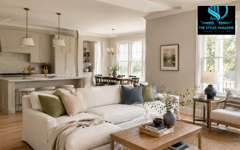
Sherwin-Williams Accessible Beige SW 7036 is a warm neutral that sits between beige and gray. It has enough beige to feel welcoming, but its gray influence keeps it softer and more current than the strong golden beiges commonly found in older interiors.
Accessible Beige remains popular because it works with many common home finishes, including warm wood, cream-colored fabrics, stone, white trim, dark accents, and muted natural colors. Sherwin-Williams describes it as a beige with gray undertones and recommends pairing it with earthy shades. The company lists its Light Reflectance Value at 57.67, which is normally rounded to 58. This gives the color a light-to-medium appearance rather than the bright, airy look of an off-white. ting and nearby finishes can make Accessible Beige appear warmer, grayer, greener, or more taupe. Understanding its undertones, lighting changes, ideal uses, and coordinating colors can help you decide whether it is right for your home.
Accessible Beige Quick Guide
| Feature | Details |
| Brand and code | Sherwin-Williams SW 7036 |
| Color family | Warm beige-first greige |
| LRV | Approximately 58 |
| Main undertones | Gray, taupe, and subtle green-gray |
| Best rooms | Living rooms, bedrooms, bathrooms, kitchens, and hallways |
| Best trim pairing | Pure White SW 7005 or another balanced soft white |
| Suitable accents | Olive green, muted blue, charcoal, brown, terracotta, and bronze |
| Possible drawback | May look darker, cooler, or muddy in rooms with limited natural light |
| Best testing method | View a large paint sample throughout the day |
What Color Is Sherwin-Williams Accessible Beige?
Accessible Beige is often described as a greige, but it is more helpful to think of it as a beige-first neutral with a noticeable gray influence. The beige side gives it warmth, while the gray side reduces the yellow and orange tones that can make traditional beige feel dated.
On a wall, the color may look like a soft stone beige, light mushroom, or muted taupe. It is not a pale cream, and it is not a true gray. In bright rooms, its warmth may become more noticeable. In dim rooms, the gray and taupe qualities can move forward and give it a deeper appearance.
This balance allows Accessible Beige to work with different interior styles. It can complement traditional wood furniture, contemporary black accents, natural woven materials, and simple modern décor. Sherwin-Williams describes the shade as different from many beiges because its gray undertones give it a warm yet balanced appearance. Beige Undertones and LRV
The main undertone in Accessible Beige is gray, but many people may also notice taupe or a quiet green-gray cast. Undertones are subtle color directions that become easier to see beside flooring, tile, fabric, countertops, or other paint colors.
Accessible Beige has an LRV of 57.67, usually rounded to 58. LRV, or Light Reflectance Value, measures how much light a paint color reflects. Colors with higher values reflect more light, while those with lower values absorb more light and appear deeper.
Accessible Beige reflects a useful amount of light, but it still has enough depth to remain visible against white trim. It will not brighten a dark room in the same way that a pale cream, off-white, or high-LRV neutral would. Sherwin-Williams places colors in the 50-to-60 LRV range within the middle neutral area, where they reflect light without looking washed out. een-gray note may become more noticeable when Accessible Beige is placed near pink-beige tile, red-toned wood, purple-gray flooring, or strong yellow cream. This does not mean the paint will look clearly green. It means surrounding materials can influence how the eye reads the color.
How Lighting Changes Accessible Beige
Natural light has a major effect on Accessible Beige. In north-facing rooms, daylight is usually cooler and softer. The paint may look grayer, more taupe, or slightly muted in this setting. If the room also has limited windows, dark flooring, or heavy furniture, the color can feel deeper than expected.
South-facing rooms usually receive warmer, more consistent light. In these spaces, Accessible Beige commonly looks warmer and more open while still maintaining its soft gray balance.
East-facing rooms receive warmer sunlight during the morning and cooler light later in the day. Accessible Beige may look warm and creamy early in the morning before becoming more muted during the afternoon and evening.
West-facing rooms experience the opposite pattern. The color may appear cooler or more neutral earlier in the day and warmer during the late afternoon. Sherwin-Williams highlights these directional changes when explaining how room orientation affects paint colors. ghting also matters. Warm bulbs can bring forward the beige and taupe side, while cooler bulbs may make the gray-green quality easier to notice. Test a large sample on more than one wall and view it in the morning, afternoon, evening, and under your normal nighttime lighting. Sherwin-Williams recommends using paint samples to see how lighting and other room elements affect a color throughout the day. and Spaces for Accessible Beige
Accessible Beige works well in living rooms, dining rooms, hallways, family rooms, and open-concept areas. It gives white trim visible contrast while allowing furniture, artwork, rugs, and wood finishes to remain the main focus.
In a living room, the color can create a comfortable background for neutral furniture, wood coffee tables, woven rugs, and darker accents. In a dining room, it can provide enough warmth to make the space feel inviting without becoming too formal or heavy.
Accessible Beige can also work as a whole-house neutral when the rooms share similar warm or neutral permanent finishes. In an open floor plan, using one adaptable neutral can improve the visual flow between connected spaces. Sherwin-Williams recommends choosing a light or neutral shade that works with the home’s natural light when carrying one color through an open-concept layout. be less successful in a very dark room with cool gray flooring and little contrast. Under these conditions, it can appear flat, muddy, or heavier than expected. It may also clash with strongly pink-beige tile or very cool blue-gray stone.
Before using Accessible Beige throughout the house, compare it with the permanent materials in every major room. A shade that looks attractive in a bright living room may behave differently in a darker hallway or north-facing bedroom.
Accessible Beige in the Bedroom
An Accessible Beige bedroom can feel calm, warm, and settled. The color gives walls more softness than a cool gray while remaining quieter than a strong tan or golden beige.
For a light and relaxed bedroom, pair Accessible Beige with off-white bedding, oatmeal linen, pale oak furniture, soft cream curtains, and small touches of muted green or blue. This combination keeps the room bright while maintaining a natural, comfortable mood.
For a deeper bedroom design, add walnut furniture, charcoal textiles, olive green, rust, or dark bronze details. These colors create contrast without fighting the muted character of the walls.
Carpet and flooring will also influence the final result. Warm beige carpet may make the paint look slightly grayer, while cool gray flooring may bring out its beige or green-gray side. Natural oak flooring usually supports its warm, earthy character.
Lighting should match the mood you want. Warm or soft-white bedside lamps usually strengthen the cozy beige side. A room with cool daylight and cooler bulbs may show more gray or taupe. Furniture, carpet, curtains, and shelving can also change how wall colors are perceived. ssible Beige in a Bathroom
Accessible Beige can make a bathroom feel softer than plain gray and less creamy than traditional beige. It works best when the tile, countertop, vanity, and floor have warm, neutral, or earthy undertones.
White quartz, warm marble, cream tile, natural wood, brushed brass, bronze, and matte black can all sit comfortably beside Accessible Beige. A medium or dark wood vanity creates a traditional or transitional look, while a pale oak vanity feels more modern and relaxed.
In a small bathroom with little natural light, the color may appear darker and more taupe. A large mirror, pale countertop, white ceiling, and good overhead lighting can help prevent the space from feeling closed in.
The bathroom’s existing tile is especially important. Accessible Beige may work well with warm white, cream, tan, or earthy stone tile. It should be tested carefully with pink-beige tile, icy white tile, or cool blue-gray flooring because these surfaces can reveal undertones that were not obvious on the color chip.
Choose bulbs carefully as well. Warm bulbs can make the room feel inviting, but very yellow lighting may push the paint too far toward tan. Cooler bulbs may reveal more gray-green. Paint finish also affects how light moves across a wall, and Sherwin-Williams explains that both the light source and gloss level can influence color appearance. Beige Cabinets and Kitchen Design
Accessible Beige cabinets offer a softer alternative to bright white and a warmer alternative to gray. On cabinets, the shade may look slightly richer than it does across a large wall because the color is divided across doors, drawers, frames, and shadowed areas.
White oak is a natural partner because both colors share a warm, muted quality. Brass hardware can strengthen the warmth, while matte black hardware creates clearer definition. Bronze and brushed nickel may also work when they coordinate with the appliances, lighting, and fixtures.
White or cream quartz can keep the kitchen feeling light. Softly veined marble can add movement without overwhelming the cabinet color. Sherwin-Williams also highlights the compatibility of warm beige tones and white oak when discussing related neutral palettes. e the cabinet sample directly with the backsplash and countertop. A bright blue-white backsplash can make Accessible Beige look warmer or slightly greener. A strongly yellow cream surface may make the cabinets appear grayer.
If Accessible Beige is used on the cabinets, consider a balanced white or very light warm neutral for the walls. Using the same mid-tone beige on every major surface could make the kitchen feel flat unless there is enough contrast from countertops, flooring, hardware, and backsplash materials.
Building an Accessible Beige Color Palette
A successful Accessible Beige color palette needs contrast, texture, and a clear temperature direction. Without these elements, a room filled only with similar beige shades may look flat.
For a warm neutral palette, combine Accessible Beige walls with soft white trim, cream upholstery, light oak, camel leather, and dark brown accents. The result feels comfortable and natural without relying on strong colors.
An earthy palette can include olive green, terracotta, natural linen, clay-colored pottery, warm wood, and aged brass. These colors strengthen the organic character of Accessible Beige and work especially well in living rooms, bedrooms, and dining areas.
A more modern palette may use Accessible Beige with Pure White, charcoal, black metal, and simple pale wood. The dark accents create definition, while the warm wall color prevents the room from feeling cold.
For a coastal-inspired room, combine it with muted blue, weathered wood, warm white, and woven materials. Avoid very icy blues unless they coordinate with the flooring and other permanent surfaces.
Keep the palette balanced by repeating important colors in more than one place, such as charcoal in lighting and frames or muted blue in a rug and cushions. Different textures, including linen, wood, stone, metal, and woven fiber, can add depth even when the overall color scheme remains quiet.
Accessible Beige Complementary Colors
Accessible Beige works well with colors that share its muted, natural quality. Deep green can strengthen its earthy character. Muted blue can create a calm contrast and make the beige look slightly warmer. Charcoal and deep bronze add definition, while terracotta and warm brown bring out its cozy side.
Sherwin-Williams officially lists Pure White SW 7005, Aesthetic White SW 7035, and Urbane Bronze SW 7048 as coordinating colors for Accessible Beige. These options provide three useful design directions: a clean soft white, a related light neutral, and a dark grounding accent. e choices may include olive, sage, dusty blue, navy, mushroom brown, rust, clay, and muted black. The colors do not need to be dark, but they should provide enough difference from the walls to keep the room visually interesting.
The best accents depend on the fixed finishes already in the space. Green-gray stone may support olive or sage. Warm wood can suit cream, bronze, or muted blue. Cool gray flooring may need warmer textiles and natural wood to stop the walls from appearing dull.
Best White Trim Colors for Accessible Beige
Sherwin-Williams Pure White SW 7005 is one of the safest trim choices for Accessible Beige because it is bright without being extremely stark. Sherwin-Williams describes Pure White as a versatile white with a slight yellow undertone that keeps it from appearing too sharp. The company also lists it as an official coordinating color for Accessible Beige. te SW 7035 creates a softer, lower-contrast result. It can be useful when you want the trim and walls to blend gently instead of creating a sharp border.
Alabaster SW 7008 is warmer and creamier. Sherwin-Williams describes it as a soft, balanced warm white. It can create a comfortable effect, although it should be tested carefully beside warm flooring, cream fabrics, and yellow-toned lighting. e White Dove OC-17 is another soft white that may create gentle contrast, but paint colors from different brands should always be sampled together before making a final decision. creates stronger contrast, while a creamy white blends more softly but may emphasize yellow tones in a very warm room. Compare the white and beige samples together because a white that looks neutral alone may appear yellow, blue, or gray when placed next to Accessible Beige.
Accessible Beige vs Agreeable Gray
Accessible Beige and Agreeable Gray are both warm neutrals, but they do not produce the same result. Accessible Beige is warmer, deeper, and more beige-forward. Agreeable Gray SW 7029 is more gray-forward with a beige undertone.
Sherwin-Williams describes Agreeable Gray as a gray with subtle warmth and lists its LRV at approximately 60.4. This makes it slightly lighter than Accessible Beige, which has an LRV of 57.67. ccessible Beige SW 7036 | Agreeable Gray SW 7029 |
|—|—|—|
| Main appearance | Warm beige with gray influence | Warm gray with beige influence |
| Approximate LRV | 58 | 60 |
| General feeling | Warmer, earthier, and cozier | Lighter, grayer, and more restrained |
| Often works with | Warm wood, cream, stone, and earthy finishes | Mixed neutrals, gray décor, and lighter schemes |
| Possible concern | Can look taupe or muddy in dim, cool light | Can appear cooler beside some finishes |
Accessible Beige may be the better option when the home contains warm wood, beige stone, cream fabrics, or natural earthy colors. Agreeable Gray may be more suitable when you want a lighter gray appearance that still has some warmth.
The best choice should be based on the actual room rather than online photographs. Place large samples of both colors beside the flooring, cabinets, furniture, and trim, and observe them under daytime and nighttime light.
Can You Buy Accessible Beige at Home Depot?
Accessible Beige SW 7036 is a Sherwin-Williams color, so the original formula and official samples come from Sherwin-Williams.
Home Depot mainly sells paint brands such as Behr, Glidden, and PPG, but it offers in-store color-matching services. Home Depot states that it can match colors, including shades it did not originally mix, and its Pro paint service describes free color matching from a physical sample. y create a close Accessible Beige match in another paint brand, but the result should not be assumed to look perfectly identical. Paint bases, pigments, sheen levels, application methods, and lighting can all affect the finished color.
Sherwin-Williams also explains that different formulas and reflective surfaces can produce visible color differences under changing lighting conditions. st representation of Accessible Beige, begin with an official Sherwin-Williams sample and test it in the room. If you prefer a paint sold at Home Depot, compare a dried color-matched sample with the official Sherwin-Williams sample before purchasing several gallons.
Conclusion: Is Accessible Beige Right for Your Home?
Accessible Beige is a practical choice for homeowners who want a warm neutral with more balance than a traditional golden beige. Its beige base creates comfort, while its gray, taupe, and slight green-gray influences keep it muted and flexible.
It can work in bedrooms, bathrooms, kitchens, living areas, hallways, dining rooms, and open floor plans. It is especially suitable for spaces containing warm wood, soft white, natural stone, cream fabrics, or earthy accents.
Its main challenge is its sensitivity to lighting and surrounding materials. Cool northern light can make it appear grayer or deeper, while warm southern or western light may reveal more beige. Flooring, cabinets, light bulbs, trim, countertops, and furniture can also change the way it appears.
Before using Accessible Beige across a full room or throughout the house, test a large sample beside the permanent finishes and examine it at several times of day. Sherwin-Williams warns that on-screen color may differ from real paint. A real-room sample is the most reliable way to decide whether Accessible Beige provides the warm, balanced appearance you want. f you need the matching meta title, meta description, featured snippet, and FAQs.
Frequently Asked Questions
Is Accessible Beige more beige or gray?
Accessible Beige is more beige than gray. Its gray influence softens the warmth and prevents it from looking overly yellow, orange, or similar to the golden beige colors common in older homes.
Does Accessible Beige look green?
Accessible Beige can show a subtle green-gray undertone under certain lighting conditions or beside pink, red, or purple-toned finishes. It does not normally appear clearly green across an entire room.
Is Accessible Beige suitable for a dark room?
It can work in a dark room, but it may look deeper, grayer, or slightly muddy. Test a large sample and use pale furnishings, white trim, mirrors, and sufficient lighting.
What white trim goes with Accessible Beige?
Sherwin-Williams Pure White SW 7005 is a dependable choice because it creates clean but gentle contrast. Aesthetic White offers a softer look, while creamier whites should be tested for unwanted yellow tones.
Which is better, Accessible Beige or Agreeable Gray?
Choose Accessible Beige for a warmer, beige-focused room with wood and earthy finishes. Choose Agreeable Gray when you prefer a lighter, more gray-forward neutral that works with cooler or mixed décor.
Enjoyed it? Find more exclusive content on The Styles Magazine.
Disclaimer: Paint colors can look different because of lighting, sheen, room direction, and surrounding finishes. Always test an official Accessible Beige sample in your space before purchasing paint for the full project.