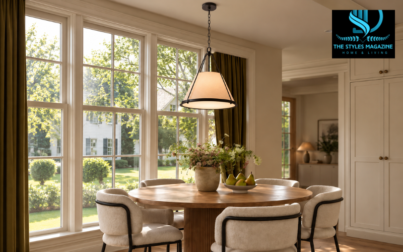
A pendant can look incredibly current today and strangely specific a few years from now.
Maybe it is sculptural. Maybe it is all over your feed. Maybe the product photo makes the whole room look instantly finished.
That does not make it a bad choice. But lighting is different from a pillow, rug, or vase. It is harder to swap on a whim, and it tends to stay in the room while furniture, paint colors, artwork, and accessories change around it.
So the better question is not simply, “Does this pendant look modern?”
It is: Will this fixture still make sense if the rest of the room changes?
A good modern pendant does not need to be boring or anonymous. It can still have shape, texture, and personality. The key is choosing one whose scale, material, silhouette, and light output belong to the room rather than to a short-lived trend.
Start With the Room, Not the Fixture
A pendant never exists by itself.
It hangs over something, beside something, or in the middle of a sightline. That context should come before the fixture style.
Start by identifying what the light actually needs to relate to:
- a kitchen island;
- a dining table;
- an entryway;
- a bedside zone;
- a bathroom vanity;
- an open corner that needs both light and visual interest.
A pendant over a dining table can usually hang lower because nobody walks underneath it. A fixture over a kitchen island has to work with both the countertop and the people looking across it. A bedroom pendant may need to feel softer and quieter. A bathroom introduces completely different concerns around moisture, glare, and clearance.
This is why it is risky to choose a fixture from a product photo first and figure out the room later.
The room should tell you what kind of pendant it can support.
Get the Scale Right Before Falling in Love With the Finish
Finish is often what attracts people first. Brass, matte black, frosted glass, warm wood, or woven fiber can completely change the personality of a fixture.
But scale usually matters more.
When comparing a modern pendant light, look at its actual diameter and overall drop before judging the finish in a styled product photograph.
Check:
- fixture diameter
- overall fixture height;
- maximum and minimum hanging length;
- ceiling height;
- the width of the table, island, or furniture below;
- the distance from nearby walls and cabinets;
- seated and standing sightlines.
A beautiful fixture that is too small can look temporary or accidental. One that is too large can dominate the room long after the initial excitement wears off.
Visual weight matters too.
A clear glass globe and a solid metal dome can have the same diameter but feel completely different. The glass fixture allows the room to remain visible through it, while the opaque shade reads as a stronger object.
This is especially important in open-plan homes, where the pendant may be visible from 15 or 20 feet away.
Judge the actual silhouette, not just the number in the dimensions box.
Materials Usually Age Better When They Belong to the Room
A material does not become timeless simply because it is natural, expensive, or currently popular.
It ages well when it makes sense with the rest of the space.
Glass can feel almost invisible in a room that already has strong architecture. Metal can add definition to soft materials. Linen can calm a space filled with hard surfaces. Wood and woven fiber can introduce warmth without requiring more furniture or decoration.
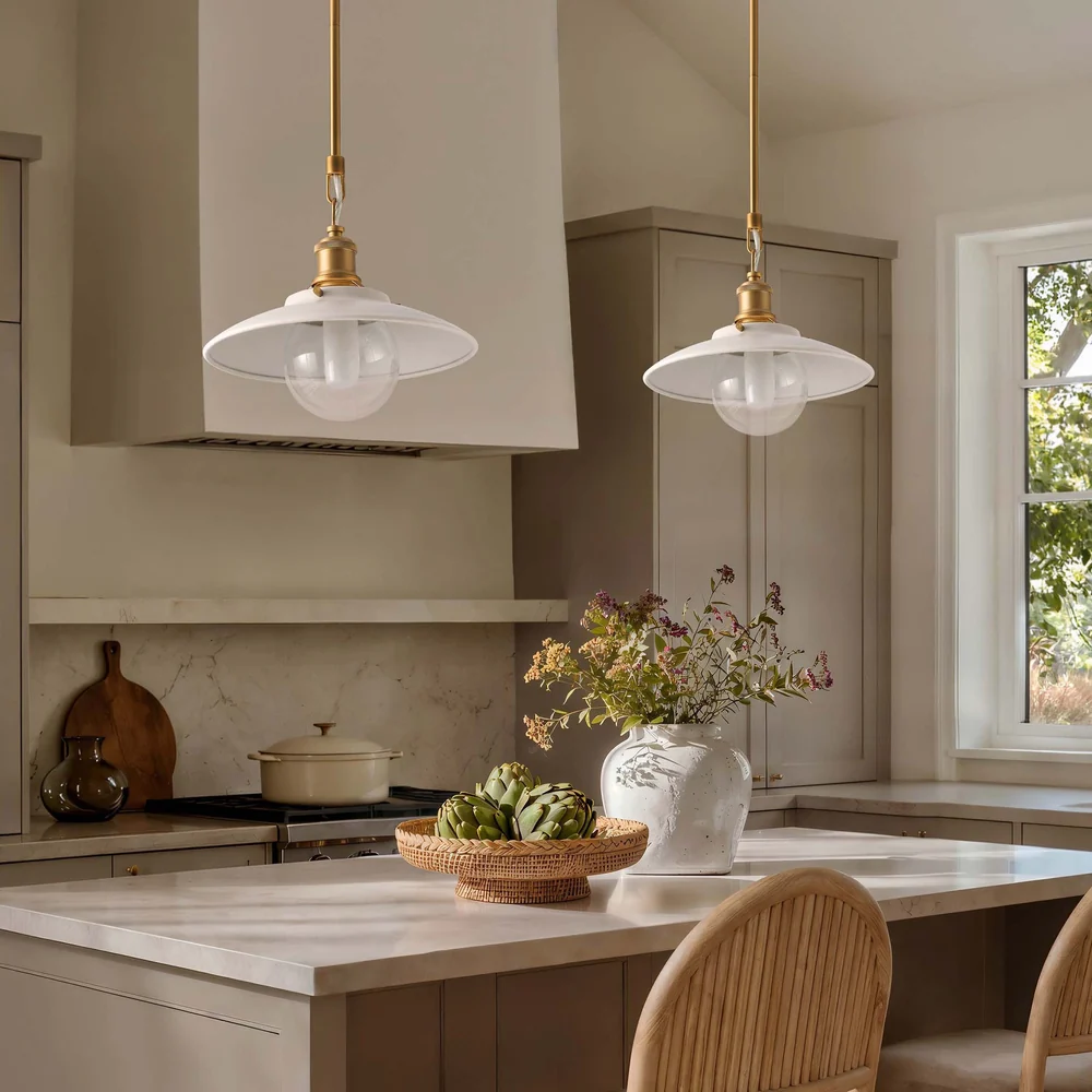
Mixed-material fixtures can work too, but restraint helps.
Think about what the room already has:
- lots of stone or polished surfaces;
- warm wood cabinetry;
- metal hardware;
- soft textiles;
- visible grain, weave, or handmade texture.
If the room is already rich in texture, the pendant may need to be simpler. If everything is smooth and hard, a tactile shade can provide useful contrast.
This is one reason natural materials can work well in contemporary lighting. Rattan, wood, linen, ceramic, and woven fibers bring variation into a room without necessarily making it feel traditional.
The material should feel like part of the room’s vocabulary, not like an accessory imported from another style.
Decide Whether the Pendant Should Lead or Support
Not every light needs to be the focal point.
This is an especially useful decision to make in modern interiors, where several strong elements may already be competing for attention.
A sculptural fixture can work beautifully in a simple dining room, a restrained entry, or a kitchen with relatively quiet cabinetry.
In that context, the pendant has room to lead.
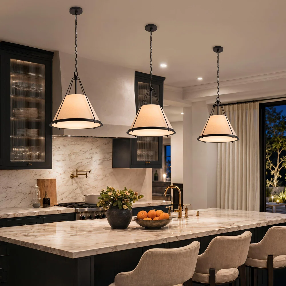
If the kitchen has dramatic stone, a large range hood, bold cabinetry, expressive chairs, and strong hardware, the lighting may work better if it supports those elements instead of competing with them.
One common mistake is letting everything try to be memorable at once:
statement pendant + statement backsplash + statement chairs + statement hardware.
Nothing gets a chance to feel important because everything is asking for attention.
A fixture that ages well often understands its role in the hierarchy of the room.
Think About the Light It Produces, Not Just the Light You See
A pendant is still a light source.
That sounds obvious, but it is easy to forget when shopping by appearance.
Different shade constructions change how the fixture performs:
- Opaque shades often direct more light downward.
- Clear glass spreads light more broadly but can expose the bulb and create glare.
- Frosted glass softens the source and reduces visual harshness.
- Woven shades can create patterned, filtered, or diffused light depending on weave density and construction.
- Open-bulb fixtures can feel airy but may be uncomfortable at eye level.
Think about what the room actually needs.
Over a kitchen island, task visibility may matter. Over a dining table, a softer atmosphere may be more important. In a bedroom, glare becomes especially noticeable at night.
Dimming can help, but it should not be used to rescue a fixture that fundamentally distributes light in the wrong way.
Modern pendant lighting works best when it is part of a layered plan. Recessed lights, sconces, lamps, and under-cabinet lighting can handle other tasks so the pendant does not have to do everything.
A Bathroom Changes the Decision
A pendant that works beautifully in a dining room is not automatically appropriate for a bathroom.
The bathroom adds moisture, tighter clearances, mirrors, and different electrical considerations.
If you’re specifically choosing a pendant light for bathroom use, start with fixtures intended for that setting rather than adapting a dining-room pendant simply because the shape works.
Then look at placement.
A pendant beside a vanity mirror should not create glare at eye level. A fixture near a sink or wet area needs to suit the actual installation environment. A pendant hanging in an open part of the room still has to leave comfortable head clearance.
Also think about the mirror.
At night, exposed bulbs and clear glass can reflect strongly in mirrors. That can make a fixture that looked subtle in daylight feel much brighter than expected.
Depending on the bathroom, wall lighting may still do more of the practical work while the pendant adds an ambient or decorative layer.
Installation requirements vary by location and project, so suitability and electrical placement should be confirmed with the manufacturer information and a qualified professional rather than assumed from appearance alone.
Use the “Next Room” Test
A fixture can look completely different once you stop standing directly beneath it.
This matters most in open-plan homes.
Before making the final decision, stand in the next room.
Look at the pendant from:
- the hallway;
- the dining area;
- the living room;
- the kitchen entrance;
- any long sightline where the fixture will regularly be visible.
Then ask:
- Does it suddenly look too small?
- Does it dominate the architecture?
- Does the finish clash with another major fixture?
- Does the shape look interesting from only one angle?
- Does it still feel like part of the room rather than an object placed into it?
This is also a good way to spot trend fatigue before installation.
If the fixture’s appeal depends mainly on a very specific finish, unusual detail, or styling trick, imagine it against different paint colors and furniture.
If the basic silhouette still works, that is a good sign.
Mock Up the Pendant Before You Commit
Product photos are useful for style. They are less reliable for scale.
A quick mock-up can tell you more.
Cut a cardboard shape roughly matching the pendant’s widest point and suspend it at the planned height with string.
Then live around it for a few minutes.
Sit at the dining table. Stand at the island. Walk through the room. Look at it from the hallway.
You may discover that the 16-inch pendant you thought was oversized actually looks small, or that the sculptural 24-inch fixture blocks more of the room than expected.
This is especially helpful when choosing between contemporary pendant lights with very different visual weights.
A mock-up will not tell you how the material looks in person, but it can answer one of the most expensive questions before installation: Does this fixture belong at this scale?
Conclusion
A good pendant should have enough flexibility to stay useful through those changes.
That does not mean choosing the safest possible fixture.
A modern pendant does not need to disappear into the room to age well. It can still be sculptural and expressive.
The difference is that its scale, material, silhouette, and light should continue to make sense even after the rest of the room changes.
Enjoyed it? Find more exclusive content on The Styles Magazine.