
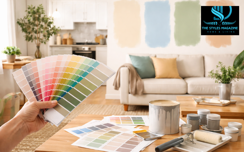
Choosing a paint color may seem simple at first. Many people walk into a store, pick a shade they like, and expect it to look the same on their walls. But in reality, learning how to choose a paint color is a more thoughtful process. The same color can look very different depending on the space, lighting, and surrounding elements.
Several factors influence how a paint color appears in a room. Natural light, artificial lighting, and even the direction your windows face can change how a color looks throughout the day. At the same time, permanent features like flooring, cabinets, and countertops already have their own tones, which can either work well with your chosen paint or clash with it. Personal taste also plays a big role, but it needs to be balanced with these practical details.
This guide will walk you through how to choose a paint color step by step. By understanding how different elements affect color, you can make a decision that feels right not just in the store, but in your home every day.
How to Choose a Paint Color
| Step | What to Do | Why It Matters |
| 1 | Observe fixed elements (floor, cabinets, etc.) | Ensures your color matches existing tones |
| 2 | Decide the room’s purpose | Helps set the right mood |
| 3 | Check lighting (natural + artificial) | Colors look different in different lights |
| 4 | Identify undertones | Prevents color clashes |
| 5 | Test large samples | Gives a realistic view of the color |
| 6 | Review at different times | Ensures consistency throughout the day |
| 7 | Choose the right finish | Affects durability and final appearance |
Start with What Already Exists in Your Room
Before you start looking at paint samples, it’s important to take a close look at what is already in your space. Many parts of a room cannot be easily changed, such as flooring, cabinets, countertops, and large fixtures. These elements have their own colors and undertones, and they should guide your paint choice rather than compete with it.
For example, a floor that looks beige might actually have a pink or yellow undertone. If you choose a wall color with a clashing undertone, the room can feel off without you knowing exactly why. This is why these fixed elements often have what designers call “veto power” when deciding how to choose a paint color.
You can also find inspiration in items that you love, such as rugs, cushions, artwork, or curtains. These pieces often combine multiple colors that already work well together. By picking one of those shades for your walls, you can create a space that feels naturally balanced.
Instead of starting with a random color, begin by observing your room. This simple step can make the entire process of choosing a paint color much easier and more successful.
Define the Mood and Purpose of the Space
Every room in your home has a purpose, and the color you choose should support that purpose. When thinking about how to choose a paint color, it helps to consider how you want the space to feel and how you will use it every day.
Colors can influence mood in subtle but powerful ways. Soft blues and greens often create a calm and relaxing atmosphere, which makes them a good choice for bedrooms and bathrooms. Warmer colors like yellow, orange, or soft red can make a space feel more energetic and welcoming, which works well in kitchens or dining areas. For home offices, cooler shades such as muted greens or light blues can help improve focus and concentration.
At the same time, your personal style matters. A color that feels peaceful to one person might feel dull to another. The goal is to find a balance between what looks good in the space and what feels right to you.
Understanding the function of the room will help you narrow down your options. Instead of choosing a color just because it looks nice, you’ll be choosing one that fits the way you live.
Understand How Lighting Changes Everything
Lighting is one of the most important factors when learning how to choose a paint color. The same paint can look completely different depending on the type and direction of light in your room.
Natural light changes throughout the day and varies depending on which direction your room faces. North-facing rooms tend to have cooler, slightly bluish light, which can make some colors look dull or gray. In these spaces, warmer tones often help balance the cool light. South-facing rooms receive more consistent, warm light, which usually makes colors appear brighter and more accurate.
East-facing rooms get warm light in the morning and cooler light later in the day, while west-facing rooms experience the opposite. This means a color that looks perfect in the morning might feel very different in the evening.
Artificial lighting also plays a role. Warm light bulbs can bring out yellow or red tones in paint, while cooler LED lights may make colors appear more neutral or slightly blue. Because of this, it’s important to view your paint choices under the same lighting conditions you use every day.
Taking lighting into account can prevent surprises and help you choose a color that looks good at all times, not just in one moment.
Learn the Basics of Color Undertones and Temperature
To truly understand how to choose a paint color, you need to look beyond the main color and focus on undertones. Undertones are the subtle hints of color beneath the surface that affect how a paint looks in different settings.
Colors are generally divided into warm and cool tones. Warm colors have hints of yellow, red, or orange, while cool colors lean toward blue, green, or gray. Even neutral shades like white, beige, or gray can have warm or cool undertones.
Identifying undertones can be tricky at first. A gray paint might appear neutral, but when placed next to other colors, you may notice it has a blue or purple base. One helpful way to spot undertones is to compare different samples side by side. This makes the subtle differences easier to see.
Mixing the wrong undertones can make a space feel unbalanced. For example, pairing a cool gray wall with warm-toned flooring might create a visual clash. On the other hand, matching undertones can create a smooth and cohesive look.
Understanding this basic concept can make a big difference and help you feel more confident when selecting a paint color.
Test Paint Samples the Right Way
One of the most common mistakes people make when learning how to choose a paint color is relying on small paint chips. These tiny samples can be misleading because they don’t show how the color will look on a larger surface.
A better approach is to test paint samples directly in your space. Instead of painting a small square, try applying a larger patch on the wall. This gives you a clearer idea of how the color will look once the entire room is painted.
Another useful method is to paint sample colors on white boards or thick paper. This allows you to move the sample around the room and see how it looks in different lighting conditions and next to different objects.
It’s also important to give yourself time. A color can look different in the morning, afternoon, and evening. By observing it over at least a full day or two, you can see how it changes and decide if it still feels right.
Testing may take a little extra effort, but it is one of the most reliable ways to avoid disappointment and choose a color you’ll be happy with.
Choose the Right Paint Finish for Each Room
When thinking about how to choose a paint color, many people focus only on the shade and forget about the finish. However, the finish, or sheen, can affect both the appearance and durability of the paint.
Matte or flat finishes have no shine and are good at hiding imperfections on walls. They work well in low-traffic areas like bedrooms or ceilings. Eggshell and satin finishes have a slight sheen and are more durable, making them a popular choice for living rooms and hallways.
For areas that need to be cleaned more often, such as kitchens, bathrooms, doors, and trim, a semi-gloss or gloss finish is usually better. These finishes are more resistant to moisture and easier to wipe clean.
The finish can also change how a color looks. A glossy surface reflects more light, which can make the color appear brighter, while a matte finish creates a softer look.
Choosing the right combination of color and finish ensures that your walls not only look good but also hold up well over time.
Create a Cohesive Flow Throughout Your Home
If you are painting more than one room, it’s important to think about how the colors will work together. A well-planned color scheme can make your home feel connected and harmonious.
Instead of choosing completely different colors for each room, consider using a consistent palette. This doesn’t mean every room has to be the same color, but the shades should relate to each other in some way. For example, you can use different tones of the same color or colors that share similar undertones.
Open-plan spaces need special attention because there are fewer walls to separate areas. In these cases, using complementary colors or subtle variations can help define different zones without making the space feel disconnected.
Transitions between rooms should feel smooth rather than sudden. When you understand how to choose a paint color with flow in mind, your entire home will feel more balanced and visually pleasing.
Common Mistakes to Avoid When Choosing Paint Colors
Even with the best intentions, it’s easy to make mistakes when selecting paint. Being aware of these common issues can help you make better decisions.
One of the biggest mistakes is choosing a color in the store without considering how it will look at home. Store lighting is often very different from natural light, which can lead to unexpected results.
Another common issue is ignoring undertones. A color that looks perfect on its own might clash with other elements in your room if the undertones don’t match.
Rushing the decision is also a problem. Skipping the testing process or choosing a color too quickly can lead to regret later. Taking the time to test and observe your options is always worth it.
Avoiding these mistakes can save you time, money, and effort, and help you feel more confident in your final choice.
Conclusion
Learning how to choose a paint color is not about finding the “perfect” shade right away. It’s about understanding your space, paying attention to details, and making a thoughtful decision that works in real life.
By considering your room’s existing elements, lighting, and purpose, you can narrow down your options and choose a color that feels right. Testing samples and taking your time allows you to see how a color truly behaves in your home.
In the end, the right paint color does more than just cover your walls. It shapes the mood of your space and influences how you feel in it every day. With a careful approach, you can choose a color that not only looks good but also makes your home more comfortable and inviting.
FAQs (People Also Ask)
How Do I Pick The Right Paint Color For My Room?
Start by looking at your room’s lighting and existing elements like flooring or furniture. Then test a few samples on your walls before making a final decision.
Why Does My Paint Color Look Different On The Wall?
Paint colors change based on lighting, wall texture, and surrounding colors. What you see on a small sample or in a store may look very different at home.
Should I Choose Paint Color Before Furniture?
It’s usually better to choose paint after furniture or décor, since paint is easier to change and should match your fixed items.
What Is The Best Way To Test Paint Colors?
Paint large sample patches or use movable boards. Check them at different times of the day to see how the color changes in your room.
Which Paint Colors Make A Room Look Bigger?
Light colors like soft whites, pale grays, and light pastels can make a room feel more open and spacious.
Disclaimer: This article is for informational purposes only. Paint results may vary depending on lighting, materials, and individual preferences. Always test samples in your own space before making a final decision.
Loved Reading This? Discover More Exclusive Stories And Updates At The Styles Magazine!